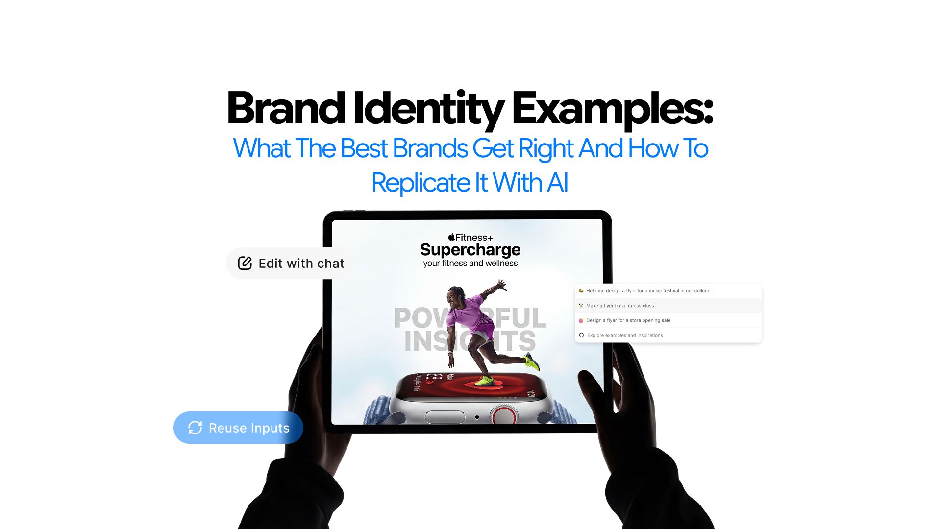
Brand Identity Examples: What the Best Brands Get Right and How to Replicate It With AI
The Internet is filled with blogs listing best brand identity examples. They list big brands and call the work inspiring. But sadly that’s where they stop.
They leave you with nothing to actually use. You will rarely find a resource that helps you identify what exactly makes their strategy strong. And, most importantly, how to replicate it for your brand.
This blog does something different.
- Deconstructs one specific strategic decision
- Explains why it worked
- Gives you an AI prompt to apply that same thinking to your own brand.
If you want to understand the full system behind building a brand identity before diving into examples, read our guide on how to create a brand identity with AI.
Differentiate the Great From The Good
Not every well-known brand is worth learning from. What makes a brand identity example genuinely useful is strategic coherence across all three layers: visual, verbal, and positional.
Sure. Great brand identity design examples are visually impressive. But they also need to be extremely precise. Every decision should connect back to a clear audience, a clear positioning, and a clear emotional territory the brand has chosen to own.
That is the lens we use for every brand below.
Mailchimp: Verbal Identity Done With Surgical Precision
The decision: Define the brand voice with enough specificity that it cannot drift.
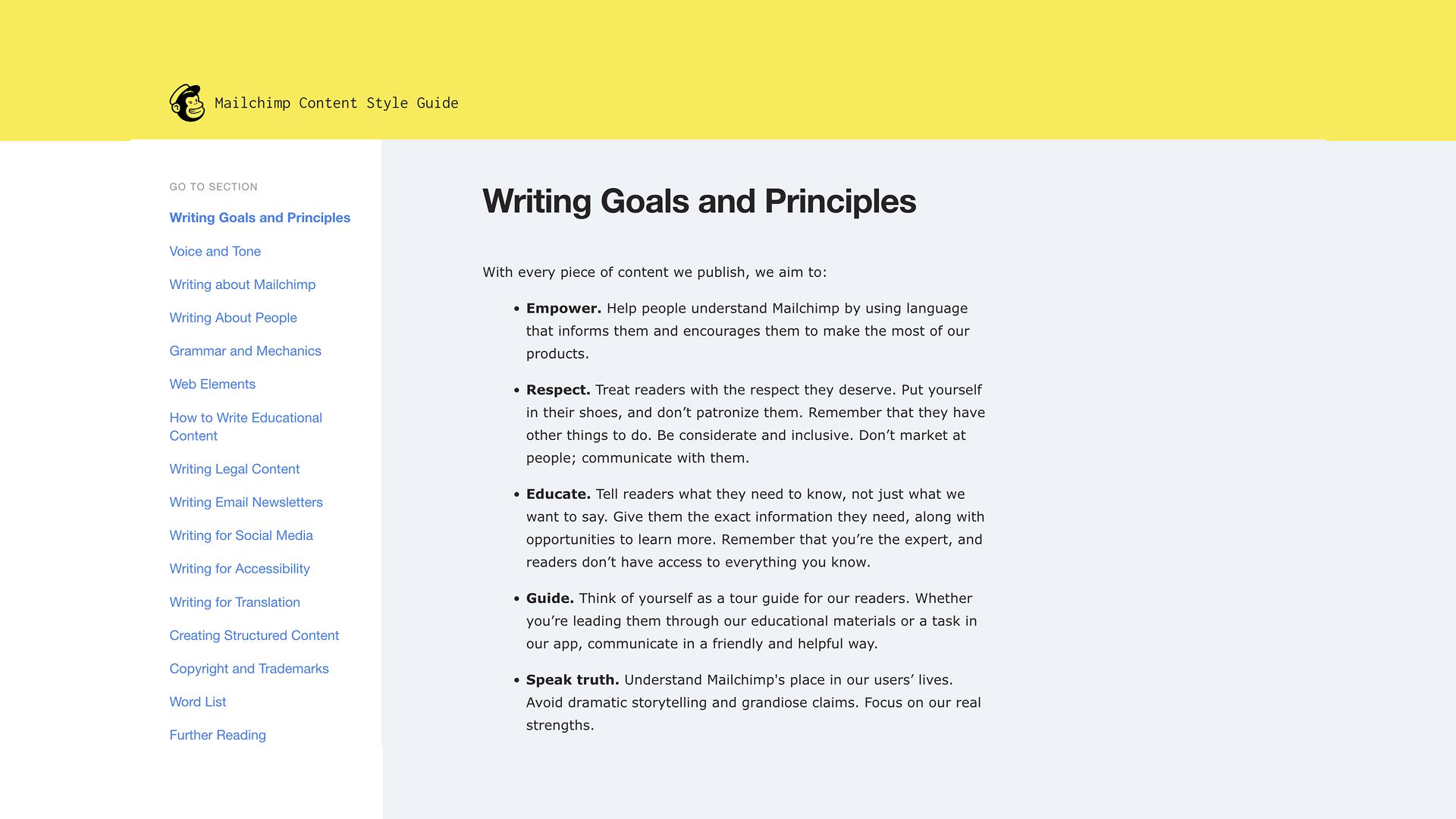
Mailchimp went the opposite direction, defining their voice as plainspoken, genuine, and a translator, while also allowing for a dry sense of humor. That description is specific enough to guide actual writing decisions.
It is not "friendly" or "approachable," two words that mean nothing in practice. It tells a writer exactly what register to operate in and gives them permission to be human without being unprofessional.
They applied this across every context, from customer service emails to in-app error messages. That consistency is what built the trust that made Mailchimp's brand feel distinct from every other tool in their category.
The strategic insight here is not the voice itself. It is the level of definition. Vague voice guidelines produce inconsistent writing. Precise ones produce a brand that sounds like a person, not a company.
What most brands get wrong: They define voice with adjectives and stop there. "Friendly, professional, clear" could describe any brand. Mailchimp's guidelines worked because they included context-specific applications, not just descriptors.
Replicate it with AI:
"My brand serves [describe your audience and their biggest frustration with your category]. Most competitors sound [describe the dominant tone in your space]. I want to differentiate through voice. Define my brand voice in three to four specific characteristics. For each characteristic, write one example of what it sounds like in an error message, one in a welcome email, and one in a social media post. Then write what each characteristic explicitly does not sound like."
The output of this prompt gives you a working voice definition with applied examples, not just abstract adjectives.
Oatly: When Positioning Becomes the Entire Brand
The decision: Choose an enemy and build every brand layer around that position.
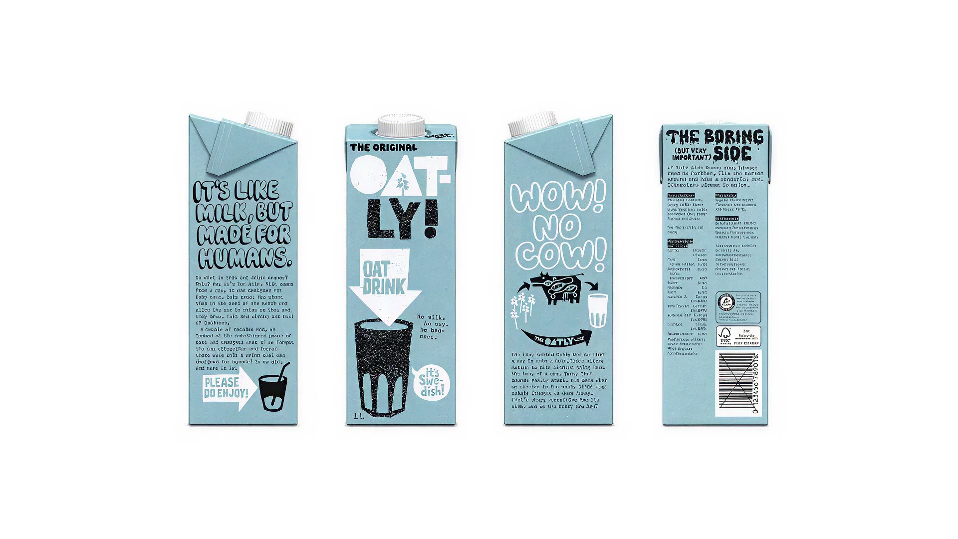
Oatly was a niche player with a media budget that was just two percent of its giant competitors. They could not outspend the dairy industry. So they chose to out-position it.
They adopted a tongue-in-cheek, chatty, irreverent tone that speaks to younger people interested in a more sustainable lifestyle, with messages that cut through the clutter and provoked the dairy industry enough to trigger a lawsuit.
The brand’s deliberately provocative slogans, such as variants of “it’s like milk but made for humans” and the “post‑milk generation” tagline, were criticized by dairy‑industry groups as misleading and disparaging to cow’s milk.
That lawsuit became a campaign. The opposition became proof of positioning.
This is what happens when positional identity is treated as a genuine strategic decision rather than a tagline exercise. Oatly's voice is authentically unapologetic, and the alignment between their voice and visual identity is seamless across written communications, design, social media, and advertising.
The test of a strong verbal identity is whether you could remove the logo, mute the color palette, and still know who it is from the words alone. Oatly passes that test.
The visual identity reinforced the positioning rather than contradicting it. The packaging was dramatically more distinctive than previous designs, and Oatly used it as a free communication channel to express both their positioning and tone of voice. Every surface became a brand expression.
What most brands get wrong: They treat positioning as a statement that lives in a deck. Oatly treated it as an operating principle that governed every decision, from packaging copy to how they responded to legal threats.
Replicate it with AI:
"I am building a brand in [describe your category]. The dominant tone in my space is [describe it]. My target audience is frustrated by [describe the specific frustration]. What emotional and strategic territory is available to me that my competitors are not occupying? Help me define a brand position that takes a clear point of view, including what we stand for, what we stand against, and how that position should show up in our voice, visual choices, and messaging."
Push back on the first answer. Ask the AI to take a more specific or more contrarian position and compare the two outputs. The more defined the point of view, the stronger the brand.
Stripe: Visual Restraint as a Strategic Decision
The decision: Build a visual system so coherent that even a major rebrand feels inevitable rather than jarring.
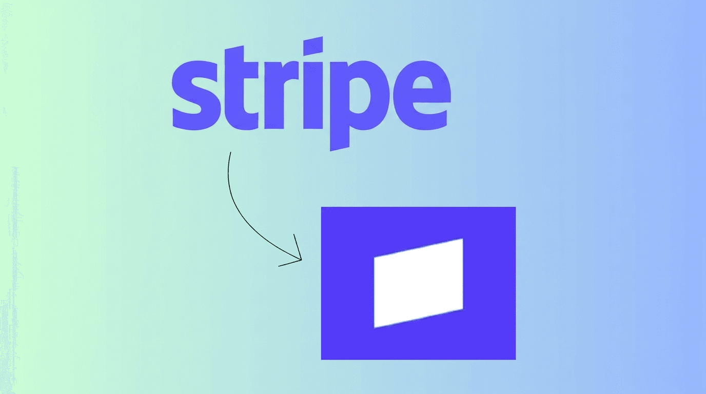
Stripe's audience is developers and technical decision-makers. That audience is skeptical of marketing by default. They respond to clarity, competence, and precision. They distrust flash.
For years, Stripe operated with a wordmark-only identity, no standalone icon, no illustrative mascot, no visual noise. That restraint was deliberate and it worked. Every decision in the Stripe wordmark communicated something specific: precise, approachable, technically sophisticated, and built to disappear into the products it powers.
Then in September 2025, Stripe rebranded. And the way they did it is the real lesson.
The new logo replaces the previous slanted "S" icon with a single white diagonal line on a blue square background, a geometric motif derived directly from the dot above the "i" in Stripe's wordmark. They did not introduce a foreign visual element. They pulled a detail that already existed inside their typography and elevated it into a standalone symbol.
The redesign was focused on simplicity and scalability, applying across Stripe's diverse product lines including their payment solution and fraud prevention service. This is what systematic brand thinking looks like. The symbol works as a favicon, an app icon, and a product logo without losing coherence.
The diagonal lines reference the slashes seen in the original mark and emphasize that Stripe is a technology company, since slashes are widely used in computer coding and file names. Nothing in the system is arbitrary. Every visual decision connects back to the audience and the brand's origin.
The strategic insight is this: a brand system built with enough internal logic can evolve without losing recognition. Stripe did not start over. They deepened what was already there.
What most brands get wrong: They make visual choices based on aesthetics and then struggle to evolve them without losing coherence. A brand system needs internal logic from the beginning, so that future decisions have something to build from rather than break against.
Replicate it with AI:
"My audience is [describe them specifically, including their professional context and how they typically evaluate tools in my category]. My three closest competitors use [describe their visual approaches]. What visual direction would signal credibility and differentiation to my specific audience? Recommend a color palette, logo format approach, and typographic direction. For each recommendation, explain the audience-specific reasoning, not just the aesthetic reasoning. Also identify one detail within the recommended system that could become a scalable visual motif across product lines and brand touchpoints."
That last instruction is the addition that matters. It pushes the AI to think about the system, not just the single deliverable.
Duolingo: One Brand Voice, Every Platform
The decision: Build a brand personality strong enough to adapt without losing coherence.
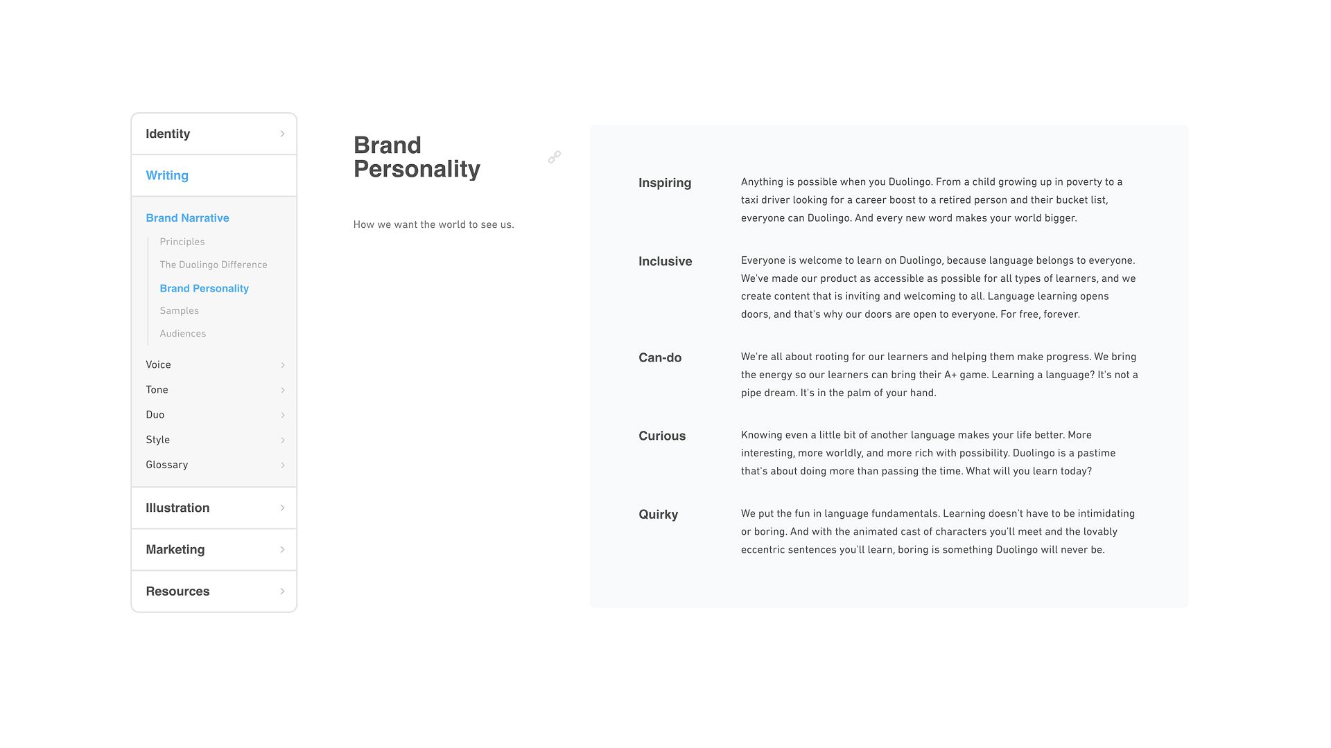
Duolingo is one of the most studied brand identity design examples in the context of platform adaptation, and for good reason. Their color palette is taken directly from their mascot, Duo, with a bright palette that reflects diversity and a clear hierarchy in usage.
That visual consistency is the foundation. But it is what they do with their personality across platforms that makes them worth studying.
- On TikTok, Duolingo leans into unhinged, self-aware humor. The brand anthropomorphizes Duo the owl in ways that are genuinely unpredictable.
- On LinkedIn, they share product milestones and learning research with a more measured but still distinctly warm tone. Inside the product, the copy is encouraging, clear, and structured.
This works because the brand personality is defined at a level deep enough to survive adaptation. It is not "fun and friendly." It is something more specific: an enthusiastic, slightly chaotic character that genuinely wants you to learn and is not afraid to be embarrassing about it.
That specificity is what holds across platforms.
The failure mode for most brands attempting this is losing the thread entirely. The website sounds corporate. Instagram feels like a different team wrote it. The product UI sounds like a legal document. Duolingo avoids this because the personality is defined precisely enough to guide different teams making different content for different platforms.
What most brands get wrong: They create one version of their brand and apply it uniformly across every platform. Platform-native expression is not inconsistency. It is intelligence. The voice stays the same. The format, register, and content type adapts.
Replicate it with AI:
"My brand personality can be described as [paste your voice characteristics]. I am active on [list your key platforms]. For each platform, describe how my brand personality should adapt in terms of content format, tone register, and the type of content that would feel native to that platform while staying true to my core voice. Give me two example post concepts for each platform that demonstrate the adaptation."
Run this prompt after completing your voice definition. It turns an abstract brand personality into a concrete platform strategy.
The AI-Powered Replication Framework
Here is how to apply everything above to your own brand, consolidated into a working process.
Step 1: Study the decision, not just the output
When you encounter a brand identity example you admire, ask what specific decision is behind it. Mailchimp's voice did not happen because they hired good writers. It happened because they defined their voice with precision before anyone wrote a word.
Step 2: Identify which layer the lesson belongs to
Is the decision positional, like Oatly? Visual, like Stripe? Verbal, like Mailchimp? Platform-specific, like Duolingo? Knowing the layer tells you where to apply it in your own brand system.
Step 3: Use AI to replicate the decision-making process, not the output
The prompts above are designed to replicate the thinking behind each brand, not copy the result. Your audience, category, and positioning are different. The process is what transfers.
Step 4: Document everything in one place
This is where most brand-building efforts collapse. Decisions get made, assets get created, and then they live in scattered files that nobody references consistently. An AI document generator consolidates your positioning, voice, visual decisions, and platform guidelines into a single brand identity document that actually gets used.
The document is the system. Without it, every new hire, freelancer, or agency brief becomes a guessing game. With it, your brand scales without losing coherence.
The Real Lesson
None of these brands succeeded because they had the biggest budget or the most talented designers. They succeeded because they made specific, deliberate decisions at every layer of their brand identity and then held those decisions consistently across every platform and touchpoint.
AI gives you the tools to make those decisions with the same rigor, regardless of your team size or budget. The prompts in this blog are the starting point. The brand identity document you build from them is the asset that makes the work compound over time.
Study the examples. Extract the decisions. Build your own system.
Frequently Asked Question
Learn how to develop and refine your brand identity to convey a consistent message.
More topics you may like
Why Document Creation Is Still Broken in 2026 — How AI Document Generators Are Fixing It

Faisal Saeed
What are AI Presentation Makers? How Are They Making a Bigger Impact With Better Slides?

Maya Collins
From Prompt to Deck in 30 Minutes – Winning AI Presentation Maker Workflow

Elena Foster

AI Presentation Maker vs PowerPoint: Why the Old Way Is Costing You More Than You Think

Lucas Reinhardt
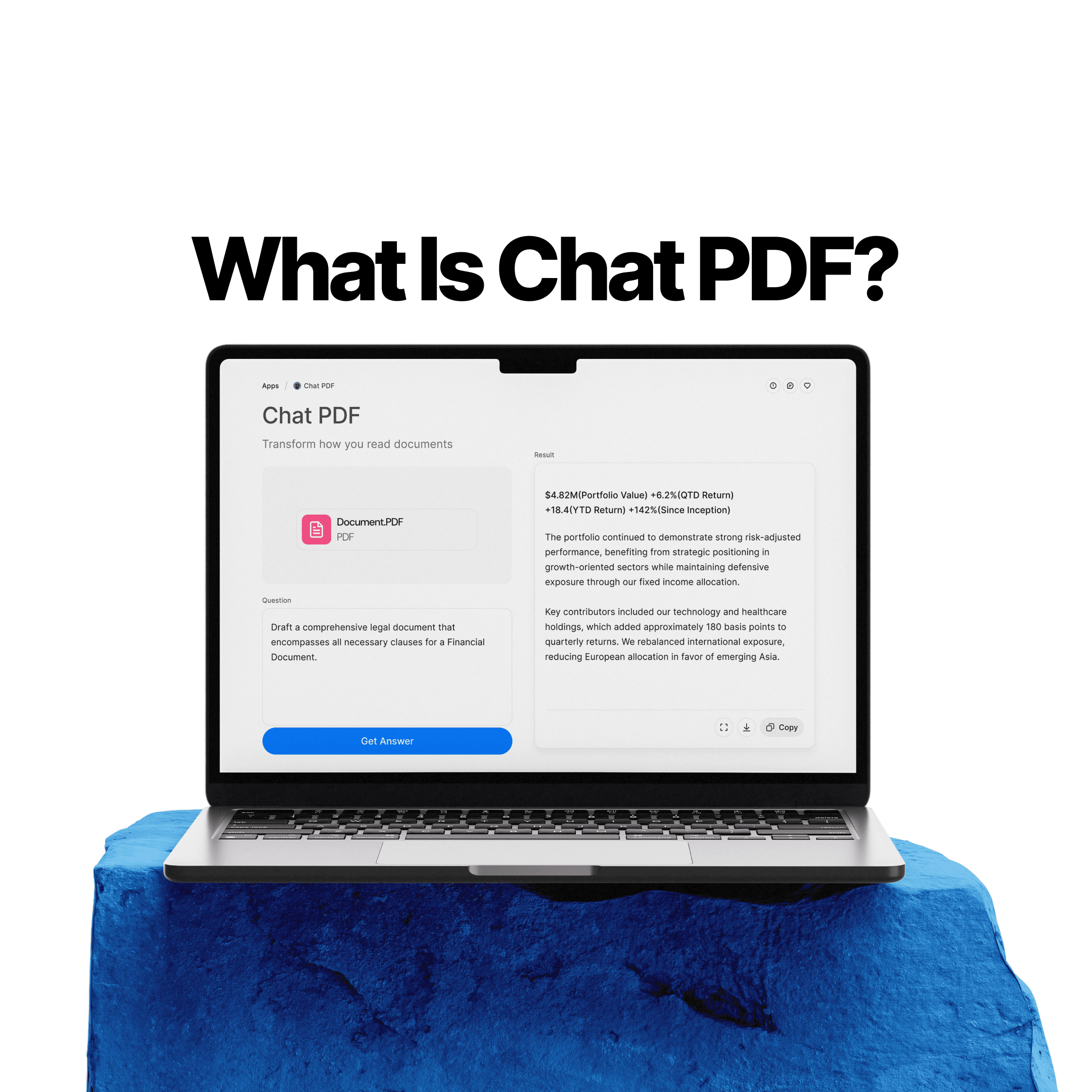
What Is Chat PDF? How to Chat With PDFs, Summarize Files, and Find Answers Faster
Elena Foster