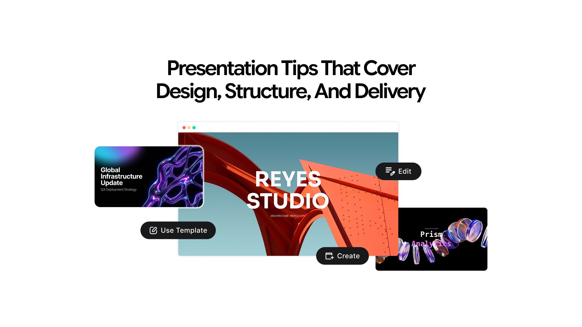
AI Prompts and Presentation Tips That Cover Design, Structure, and Delivery
A presentation can go wrong at any stage: planning, writing, or designing.
The message is not clear. The structure is borrowed from the last deck without questioning whether it serves this one. The audience is assumed rather than considered. By the time the visual work starts, the foundation is already wrong.
No amount of design can fix a presentation that does not know what it is trying to say.
This article covers all four layers of a strong presentation in the order they should be built: message first, then structure, then design, then delivery. Every tip has an AI prompt attached so the advice has a practical path to implementation. You can run all of them directly inside Chatly.
The Four Layers of a Strong Presentation
Understanding what each layer does, and why the order matters is the starting point before any of the tips make sense.
- Message: What you are actually trying to say and why it should matter to the specific audience in the room. Most presentations have a topic. Fewer have a message.
- Structure: The sequence of ideas that moves the audience from where they are to where you want them to be. A strong structure makes the argument feel inevitable. A weak one makes the audience work to follow you.
- Design: The visual language that supports the message without competing with it. Good design removes friction. Bad design creates it.
- Delivery: How the content lands in the room or on a screen. It is the layer most people over-prepare for at the expense of the first three.
Failing any one of these weakens the others. A beautifully designed deck with no clear message is a well-formatted waste of the audience's time.
Layer 1: Message of Presentation
The message layer is where every presentation actually begins, and where most of them quietly fail. Getting it right before touching any design tool is the single highest-leverage thing a presenter can do.
1. Define Your Core Message First
Every strong presentation can be reduced to one sentence.
If you cannot write that sentence before building the deck, the audience will not be able to extract it after watching it. The one-sentence message is not the title of the presentation. It is the specific thing you want the audience to believe, decide, or do differently when it ends.
A quarterly business review does not have a message of "Q3 results." It has a message of "Q3 underperformed because of one fixable problem, and here is the fix." The first is a topic. The second is a reason to be in the room.
Open Chatly's AI presentation maker, add your reference material, and use this prompt. If you already have documents or notes saved, the AI document generator can help you consolidate them into a structured brief before you start.
I am presenting [topic] to [describe your audience]. Write five possible one-sentence core messages for this presentation, each from a different angle: informational, persuasive, alarming, optimistic, and action-oriented. Then tell me which would be most compelling for this specific audience and why.
Review the options, select or combine, and use the chosen message as the filter for every slide that follows. Any slide that does not support the core message is a candidate for removal.
2. Know Your Audience Before You Know Your Content
The same information presented to different audiences needs completely different presentations.
- A board of directors wants the bottom line first, risk assessment, and resource implications
- A team of engineers wants technical depth, implementation logic, and edge case coverage
- A group of new hires wants context, relevance to their role, and clear next steps
The content may overlap, but the framing, vocabulary, depth of detail, and assumed prior knowledge are different for each group. Most presenters skip this step and build what they know rather than what the audience needs.
My audience for this presentation is [describe: role, seniority level, prior knowledge, what they care about most]. What do they already know about [topic]? What are they most likely to be skeptical about? What one outcome would make them feel their time was well spent?
Use the response to pressure-test the message and adjust the frame before a single slide is created. If your presentation is for a specific professional context, the guide on how different industry professionals use AI chat covers how different audiences expect information to be framed.
3. Separate What You Want to Say from What They Need to Hear
These are frequently different things.
What you want to say is comprehensive, sequenced from your perspective, and structured around how you understand the topic. What they need to hear is filtered, reordered around their questions, and calibrated to their level of patience and existing context.
The presenter's job is to make that translation before building the deck, not during it.
Here is the full scope of what I want to cover in this presentation: [paste your notes or rough outline]. My audience is [describe]. Cut this down to the five most important points for this specific audience. Then reorder them in the sequence that would be most persuasive or useful for them, not most logical for me.
Layer 2: Structure
Structure is the architecture of the argument. Most presentations borrow the default format without asking whether it actually serves the message. The tips in this layer address the structural decisions that most change how well an audience follows and retains information.
4. Lead with the Conclusion
Most presentations build toward the key point. Most audiences do not have the patience for that.
Leading with the conclusion and then spending the rest of the time supporting it is the structure used by senior executives for a consistent reason: the audience knows where they are going and can evaluate the evidence rather than waiting to understand what it is for.
The instinct to build up to the conclusion feels logical from the presenter's perspective. From the audience's perspective, it is frustrating.
Here is my current presentation outline: [paste your outline]. Restructure this so the key conclusion or recommendation comes first, followed by the supporting evidence and context. Keep all the same content but reorder it for an audience that wants the answer before the reasoning.
5. Use the Three-Act Structure
For presentations that need to persuade or inspire rather than simply inform, a sequential list of points is less effective than a narrative arc.
- Act 1 establishes the current state and the problem within it
- Act 2 introduces the tension, the insight, or the opportunity
- Act 3 presents the resolution and the specific action required
This structure works because it mirrors how people process the case for change. They need to feel the problem before they can commit to the solution. The same narrative logic applies when writing scripts and spoken content, which is covered in depth in the guide on how to write a script.
I need to structure a presentation about [topic] that persuades [audience] to [desired outcome]. Write a three-act narrative structure: Act 1 describing the current situation and its problems, Act 2 introducing the key insight or opportunity that changes the picture, Act 3 making the case for the solution and the specific action I want the audience to take.
6. Decide on Slide Count Before You Start Designing
The number of slides should be a deliberate decision, not a side effect of how much content you have.
A practical rule: one slide per idea, not one slide per data point or sub-bullet. A 20-minute presentation rarely needs more than 12 to 15 slides. More slides almost never mean more content. They usually mean the ideas have not been sufficiently synthesized.
I have [X] minutes to present on [topic] to [audience]. Based on this outline [paste outline], recommend how many slides I need and what each slide should cover. Identify any areas where I am trying to fit multiple ideas onto a single slide.
7. Build in a Moment of Contrast
The most memorable presentations contain at least one moment where the audience's expectation is reversed: a surprising statistic, a counterintuitive finding, or a before-and-after that lands harder than anticipated.
This moment is not decoration. It is the cognitive anchor that makes the surrounding content stick. Presentations without contrast are forgotten quickly. If you are presenting data, the AI search engine can help you find current statistics and research mid-session to strengthen these moments.
My presentation is about [topic] for an audience of [describe]. What is the most counterintuitive or surprising fact, statistic, or perspective related to this topic that would genuinely reframe how they think about it? Give me three options with the reasoning or source behind each.
Layer 3: Design
Most design advice for presentations is either too vague to act on or too software-specific to transfer. This section focuses on the design principles with the most impact on clarity, with AI prompt workflows that apply across any tool.
8. One Idea Per Slide
The most consistent mistake in slide design is asking one slide to carry multiple ideas.
When a slide contains two arguments, two data points, or two narratives competing for attention, the audience divides between them. Splitting into two slides creates two clear talking points instead of one confusing one.
Here is the content I am planning to put on a single slide: [paste content]. Identify how many distinct ideas this contains. Suggest how to split it across multiple slides so each carries only one clear message. Write a suggested headline for each resulting slide.
9. Write Headlines That Carry the Message
Most slide headlines are topic labels: "Q3 Revenue," "Market Overview," "Next Steps." These tell the audience what the slide is about but not what to think about it.
A message headline tells them the point:
- "Q3 Revenue Missed Target for the Third Consecutive Quarter"
- "The Market Is Moving Faster Than Our Roadmap"
- "Three Actions Required Before Month End"
Message headlines let the audience follow the argument even when skimming. The same principle applies to written content of any kind. The guide on what is content writing covers how headline clarity drives reader retention across formats.
Convert these topic-label headlines into message headlines that tell the audience what to conclude or think: [paste your current slide titles]. Each headline should be a complete thought, not a category label. Keep each under 12 words.
10. Use Visuals to Replace Text
The visual layer should be doing work that text cannot: showing relationships, demonstrating scale, revealing patterns, and creating emotional context. When the visual and the text on the same slide communicate the same thing, one of them is redundant.
For each of the following slide topics, suggest the most effective visual format to replace or significantly reduce the text: [list your slide topics]. Choose from the options below and explain why each format works for that specific content:- Data chart: for numbers, trends, and comparisons
- Process diagram: for sequences, workflows, and cause-and-effect
- Timeline: for chronological events or staged rollouts
- Comparison table: for side-by-side options or feature sets
- Single image with caption: for concepts with strong visual metaphors
- Illustrated concept: for abstract ideas that benefit from spatial representation
The AI presentation maker generates structured decks from a text prompt or document, handling the visual layout automatically so you can focus on whether the content is right rather than where to place elements.
For a broader comparison of what AI slide tools can produce, the guide on best AI slide generators in 2026 covers specific output examples across different use cases. If you want to understand how AI presentation tools compare to building slides manually in PowerPoint, the guide on AI presentation maker vs PowerPoint breaks down exactly where each approach wins.
11. Maintain Consistent Visual Hierarchy
Visual hierarchy is the system that tells the audience where to look and in what order. A consistent hierarchy makes the deck feel coherent and reduces the cognitive effort required to process each new slide.
Inconsistency forces the audience to relearn the layout every time a new slide appears. If you are building brand guidelines from scratch to inform these decisions, the guide on how to create brand identity with AI covers the visual system that sits behind consistent design choices.
I am designing a presentation with these brand guidelines: [describe or paste colors, fonts, and any style constraints]. Write a visual hierarchy system for my slides: specify recommended font sizes and weights for headline, subheadline, body text, and captions. Suggest which color should be used for primary emphasis, which for supporting information, and which for background. Explain the reasoning behind each recommendation.
12. Design for the Environment
Slides designed on a laptop look completely different in other environments. Font sizes readable on a desktop become illegible at the back of a conference room. Dense slides that work as standalone documents lose their structure when projected.
Before finalizing any design, consider the actual environment the presentation will be shown in:
- Large room projection: minimum font sizes, high contrast, minimal text density
- Video call: smaller effective screen size, compressed visuals, no fine detail
- Hybrid meeting: must work for both the room and the screen simultaneously
- Shared PDF for async review: can carry more text, must work without a presenter
I am presenting in [describe the environment: large room projection / video call / hybrid meeting / shared PDF for async review]. What specific design adjustments should I make for this environment? Cover minimum font sizes, contrast and color requirements, text density limits, and any format-specific issues that commonly cause problems.
Layer 4: Delivery
The final layer, and the one most people spend the most preparation time on at the expense of the first three. Delivery only works when the message, structure, and design underneath it are already solid.
13. Prepare the First 60 Seconds Deliberately
The opening 60 seconds determine whether the audience decides to pay attention to everything that follows. Most presenters spend it on things that do not earn attention: thanking people for attending, explaining what they are about to cover, or apologizing for what the audience is about to see.
A strong opening is a concrete statement that reframes what the audience thought they knew, a question they genuinely want answered, or a piece of information that makes the next 20 minutes feel directly relevant to them.
If your presentation involves a spoken keynote or formal address, the guide on how to write a speech covers the structural principles that apply to both written and delivered content.
Write three alternative openings for a presentation about [topic] to [audience]. Each should take under 60 seconds when spoken at a natural pace.Option 1 opens with a surprising statistic or fact.
Option 2 opens with a direct question the audience will want answered.
Option 3 opens with a brief concrete scenario that makes the problem feel real and immediate.Test all three. The one that makes you most uncomfortable to open with is usually the one that works best.
14. Rehearse the Transitions
The moments between slides are where most presenters lose the room.
When a presenter finishes a point, pauses to look at the screen, and begins the next slide without any connective language, the audience fragments. Transitions are what make a presentation feel like a coherent argument rather than a sequence of disconnected slides read aloud.
Here are the headlines of my slides in order: [paste slide headlines]. Write a spoken transition sentence for each gap between slides — the sentence a presenter would say as they move from one to the next. Make each transition feel like a natural continuation of the argument, not a new topic starting.
15. Prepare for the Three Hardest Questions
Most presentation anxiety centers on the Q&A, not the prepared content. The questions that create anxiety are the ones that expose a gap, challenge the core assumption, or require a confident answer to something genuinely uncertain.
Preparing specifically for the three most challenging questions transforms the Q&A from a vulnerability into a demonstration of depth and credibility.
I am presenting [topic and core message] to [audience]. What are the three most challenging or skeptical questions this specific audience is likely to ask? For each question, write a concise, confident response that acknowledges the concern directly without undermining the core message of the presentation.
The Full AI Workflow for Presentation Making
Each of the four presentation-making layers has individual prompts. Pulled together, they form a complete workflow from blank page to finished deck.
Step 1: Define the message
Before opening any presentation tool, use AI to clarify the core message and audience frame. Run the audience analysis prompt and the five-message-options prompt. Do not proceed until the one-sentence message is clear. For tips on prompting AI to get the most useful outputs, the guide on best system prompts is a useful reference before you start.
Step 2: Build the structure
Use the restructuring prompt to test whether leading with the conclusion improves the outline. Run the three-act structure prompt if the presentation needs to persuade. Use the slide count prompt to set a deliberate ceiling before design begins.
Step 3: Generate a first draft
With a clean, structured outline in hand, use an AI presentation tool to produce a first-draft deck. Chatly's AI presentation maker generates a structured deck from a prompt or document, handling layout automatically. This step should take minutes, not hours. The first draft is a starting point, not the deliverable.
Step 4: Refine the design layer
Run the message headline conversion prompt across all slide titles. Use the one-idea-per-slide prompt on any dense slides. Run the visual format suggestion prompt and the hierarchy system prompt.
Step 5: Prepare delivery
Run the three-opening-options prompt. Generate transition sentences for every slide gap. Run the Q&A preparation prompt for the three hardest questions. Rehearse the first 60 seconds until it feels natural rather than memorized.
The full process, with AI handling the generation and suggestion layer, takes a fraction of the time traditional preparation requires.
Build the Perfect Presentation with Chatly
The counterintuitive thing about presentation preparation is that the work most people do last, defining the message, understanding the audience, deciding what to leave out, is the work that should happen first.
Design is fast when the message is clear. Structure is obvious when the audience is understood. Delivery is confident when the foundation is solid.
The tips and prompts in this article are sequenced to reflect that order. Start with what you are trying to say. Build the argument. Then design the frame around it. The slides are the last thing to build, not the first.
If you want a step-by-step walkthrough of building a deck from a single prompt in under 30 minutes, the guide on how to create a presentation using AI covers the full process end to end.
A presentation built in that order does not just look better. It works.
Frequently Asked Question
Learn fundamentals of presentation design and structure and walk confidently in your next meeting.
More topics you may like

11 Deep Work Tips for a Productive Work Routine

Faisal Saeed
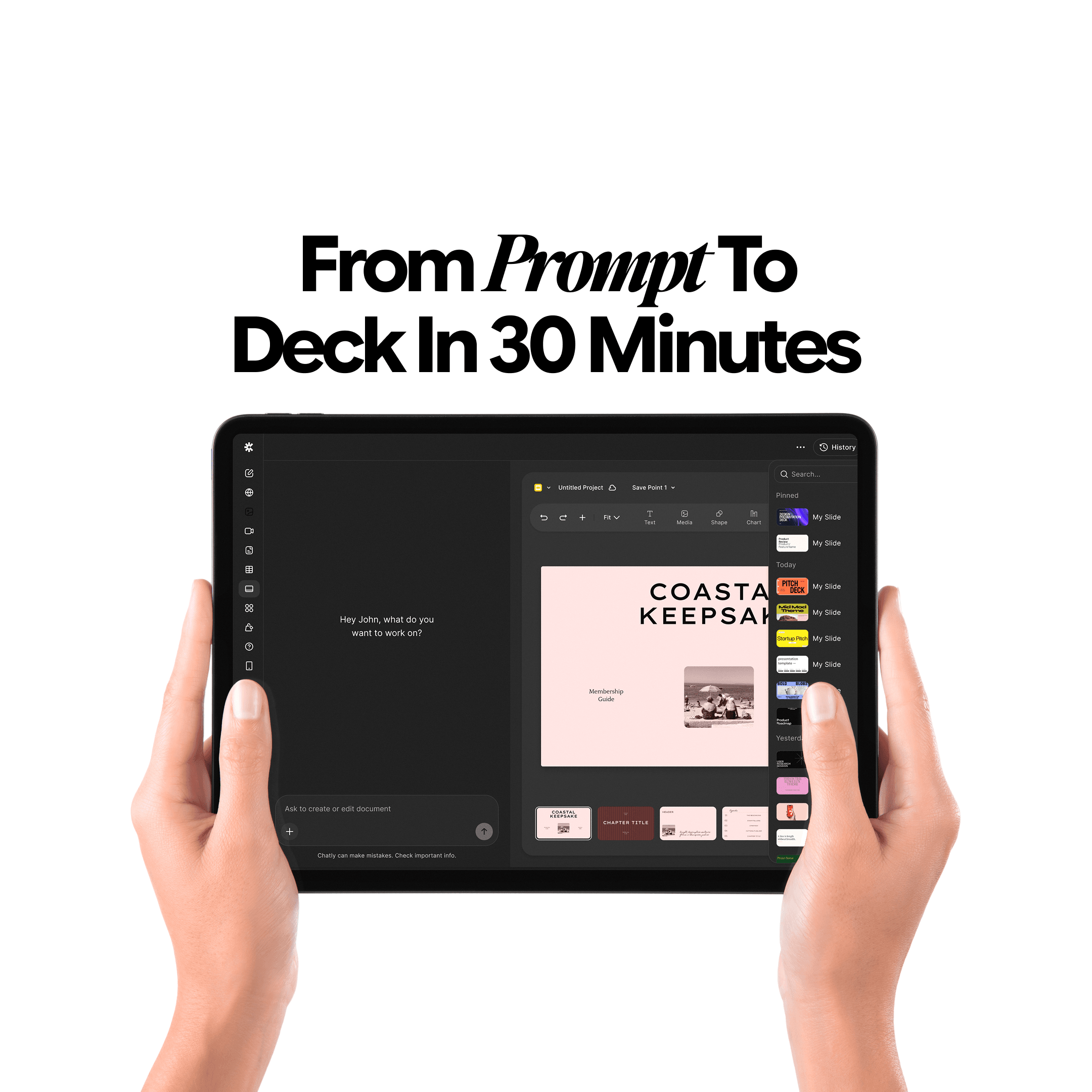
From Prompt to Deck in 30 Minutes – Winning AI Presentation Maker Workflow

Elena Foster
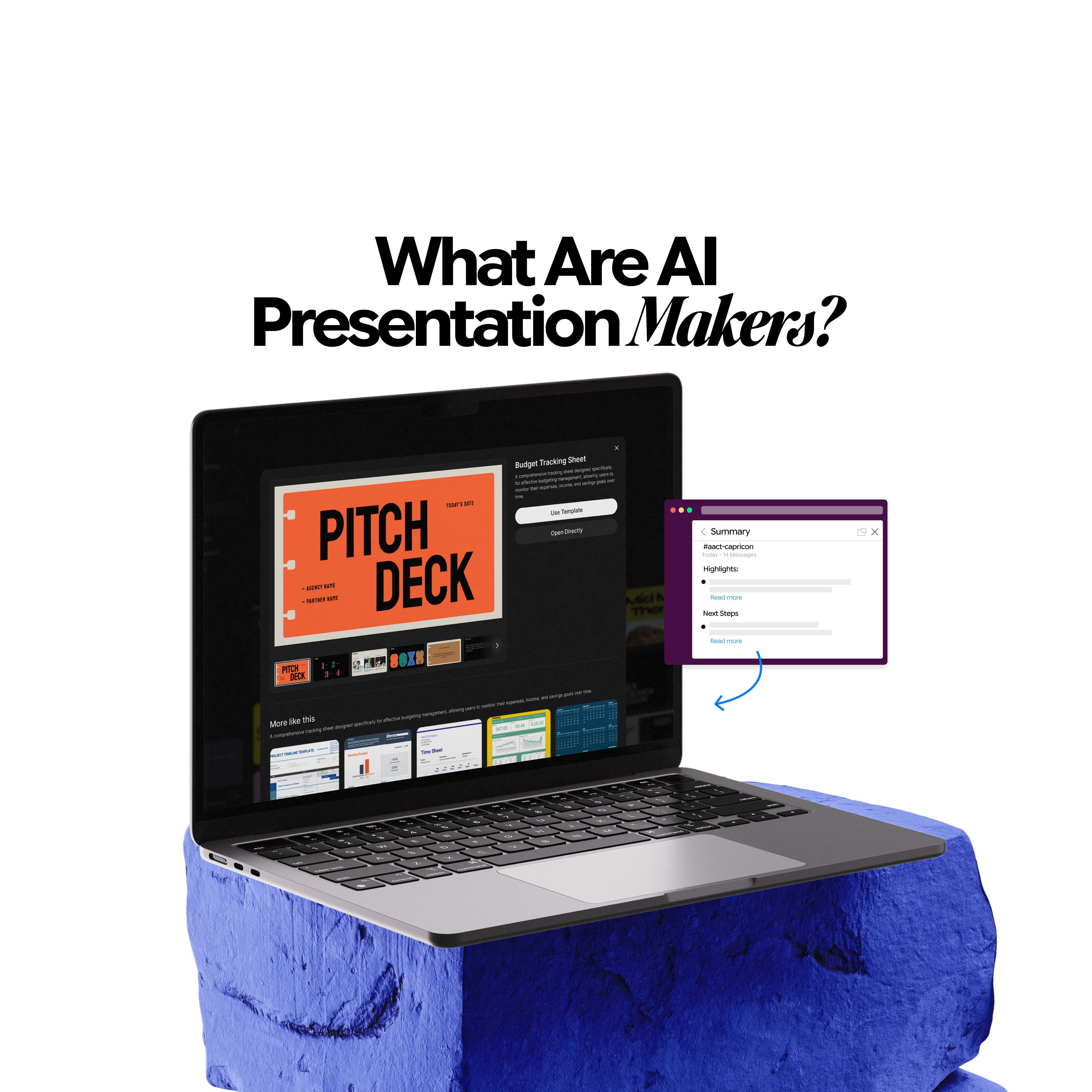
What are AI Presentation Makers? How Are They Making a Bigger Impact With Better Slides?

Maya Collins

9 Best AI Image Generation Models for Your Every Need
Faisal Saeed

Master Technical Writing & Documentation: An AI Guide

Arooj Ishtiaq